# Kommunikation und Typo
Dieser Leitfaden soll dazu dienen, die Kommunikation nach Außen zu vereinheitlichen. Er kann im Laufe der Zeit ergänzt werden.
### Bildsprache
- Bilder so natürlich wie möglich: keine Filter oder zu starke Photoshop-Bearbeitungen
- ggf. sowohl Hochformat als auch Querformat aufnehmen, um verschiedenen Medien gerecht werden zu können
### Text
#### Ansprache der Adressaten
- nach Medium differenziert
- facebook, Newsletter: ihr/euch
- instagram: du/ihr
- Website: (passiv?)
#### Stil
- Broschüren: professionell, gehobene Sprache
- Website: (?)
- Facebook: gehobene Alltagssprache, nahbar
- instagram: humorvoll, mit Augenzwinkern
#### Detailtypografie
##### Anführungszeichen
[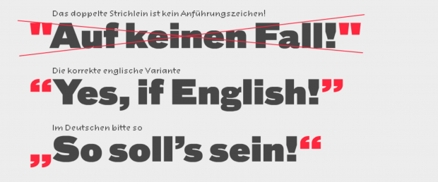](https://doku.zusammenkunft.berlin/uploads/images/gallery/2021-07/image-1625580592538.png)
Quelle: [https://typefacts.com/artikel/anfuehrungszeichen](https://typefacts.com/artikel/anfuehrungszeichen)
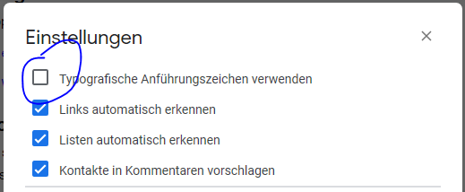
→ Am besten automatische (im Deutschen falsche) Ersetzung in GoogleDocs deaktivieren:
*Tools > Einstellungen >* *Typografische Anführungszeichen verwenden* → **Haken rausnehmen**
[](https://doku.zusammenkunft.berlin/uploads/images/gallery/2021-07/image-1625580636101.png)
→ In Veröffentlichungen "" durch „“ ersetzen:
[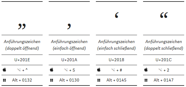](https://doku.zusammenkunft.berlin/uploads/images/gallery/2021-07/image-1625580817855.png)
- ##### Gedankenstriche/Bindestriche
normaler Binde-/Trennstrich (wie auf Tastatur):
[](https://doku.zusammenkunft.berlin/uploads/images/gallery/2021-07/image-1625580854507.png)
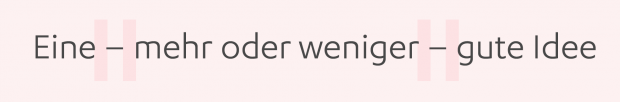
Gedankenstrich ist länger („Halbgeviertstrich“) und wird mit Leerzeichen gesetzt:
[](https://doku.zusammenkunft.berlin/uploads/images/gallery/2021-07/image-1625580870851.png)
[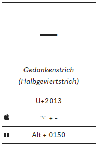](https://doku.zusammenkunft.berlin/uploads/images/gallery/2021-07/image-1625580918051.png)
Quelle und mehr dazu: [https://typefacts.com/artikel/binde-und-gedankenstrich](https://typefacts.com/artikel/binde-und-gedankenstrich)
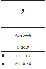
- ##### Apostroph
- in der Regel falsch verwendet, daher als Faustregel im Deutschen: *Weglassen!
*siehe auch [https://typefacts.com/artikel/apostroph](https://typefacts.com/artikel/apostroph)
- ganz falsch: GmbH`s, Nico´s Imbiss („Deppenapostroph“)
- richtig: Clemens’ Typo-Guide; so geht’s
- EN/FR:[](https://doku.zusammenkunft.berlin/uploads/images/gallery/2021-07/image-1625580967488.png)
[](https://doku.zusammenkunft.berlin/uploads/images/gallery/2021-07/image-1625580985042.png)
### Konventionen
- ##### Hervorhebungen im Text
- möglichst dezent, eher Kursivierung anstatt Fettung verwenden
- ##### Schreibweise für Orte
- WERKSTATT Haus der Statistik
- Musterhaus der Statistik (Autoscooter)
- Straßennamen (Personen mit Vor- und Nachnamen) mit Bindestrichen!
- Otto-Braun-Straße ✔ Otto Braun Strasse ×
- Karl-Marx-Allee
#####
- ##### gendergerechte Sprache mit Doppelpunkt oder Partizip-Präsens
- Bewohner:innen, Besucher:innen / Nutzende, Studierende
- Mitglieder (falsch: Mitglieder:innen!)
- ##### Zeiten und Daten jeweils möglichst einheitlich
- Kurzform: *Fr, 1.8. 13–16:30 Uhr *\[Bis-Zeichen = Gedankenstrich, ohne Leerzeichen!\]
- Langform im Text: *Freitag, den 1. August, von 13:00 bis 16:30 Uhr*
- - so nicht: *13h 13:00-16 h *
- ##### „Distanzierung“ von fremden Texten (z. B. Veranstaltenden)
- mit Hinweis: *Beschreibung der Veranstaltenden*
- Klarheit, wer kommuniziert, z. B. „Wir freuen uns über Hilfe beim Subbotnik“ = HdM spricht, nicht Initiative Haus der Statistik
- ##### Newsletter: Kursivierung von Eigennamen
- *ZK/U, raumlabor, SunSeeker e. V.* …
- ##### Föderungs-Credits klein
- Website: mit `Gefördert durch ABC` ummantelt
- Bsp: „Die Veranstaltung wird durch Kulturfördermittel der Senatsverwaltung für Kultur und Europa kofinanziert.“